Dead Graphic Design Trends
2025-03-07
👋🏿 Yowdy!
So, I'm not a Graphic Designer, but I touch on a lot of the same technologies in my work and hobbies. As a result, eventually I do pickup on hot trends like half a decade later. I wanna yap about some of those trends and why I found them so interesting for a bit.
First, let's talk about something that popped up around 4 years ago and then died within half a year.
Neumorphism
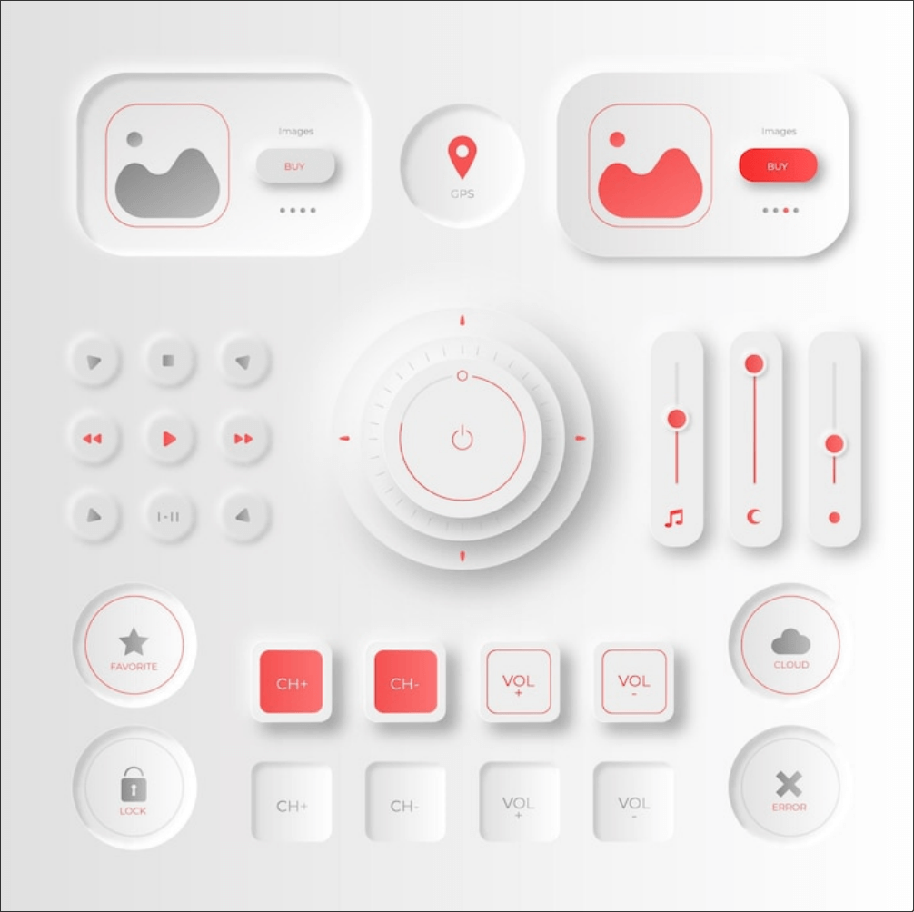
When I was a youngin' I had a toy that had buttons that looked like this. I hated them with a passion. They never felt satisfying to push, the weird rubberized coating that kept the button "sealed in" would become dry and start tearing, and it just couldn't match the feel of a good Gamecube Controller.
But as I grow older, I've learned to enjoy the little things in life. The subtleties that make things go round and tend to go unnoticed. I appreciate the mouth-feel of a piece of candy and notice when it doesn't threaten to pull out my tooth fillings. I like the comforts of a soft fabric that doesn't clog my dryer's lint filter. The clunk of a well weighted mechanical keyboard and the click of my co-worker's cherry mx blues that I'm this close to [[REDACTED]]. This extends from my taste in women to my taste in tea, and I wouldn't have it any other way.
Neumorphism is a sampling of subtle design that stems from the idea that everything is shrink wrapped in some matte colored fetish plastic. I'm 100% sure that's what the original creator was thinking when they played around a bit too much in Figma and popped out the otherside with this. It's obviously the consequence of someone who didn't delete their DeviantArt account in time for the corpo takeover. The effect is actually created with the clever use of at least 2 shadows. 3 if you want the hard edge on top of some elements.
Is there a meta narrative here that talks about the importance that we are increasingly placing on being authentic and tactile design like this is an expression of the deeper human psyche and need to become truly connected within a world that is evermore divided and schismed into camps that in another time could've grown to love each other? Maybe, but you didn't hear it from me, okay?
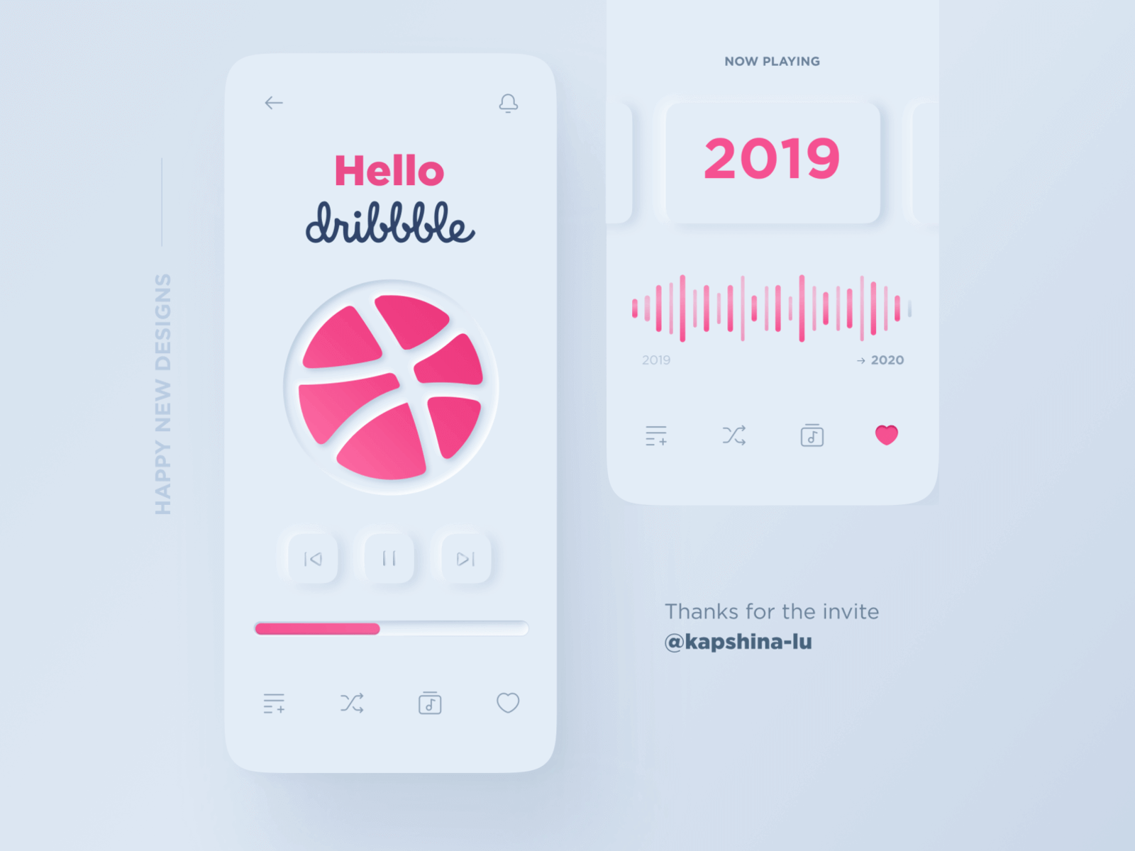
Nice. Nifty. Oh my god, it even has a watermark!
If you've ever seen one of those touch devices where the buttons vibrate as you activate them to assure you that, yes this thing IS on, the feeling I get is very similar to that. I try not to speak like an artist too much because even I get sick of being told to absorb the colors of a space and indulge in the creamy whites and pleasantly soft shadows that dance along the something something this or that. All I'm trying to say is that Neumorphism is either a fetish or a bad trip to Dubai.
Take your pick.
Claymorphism
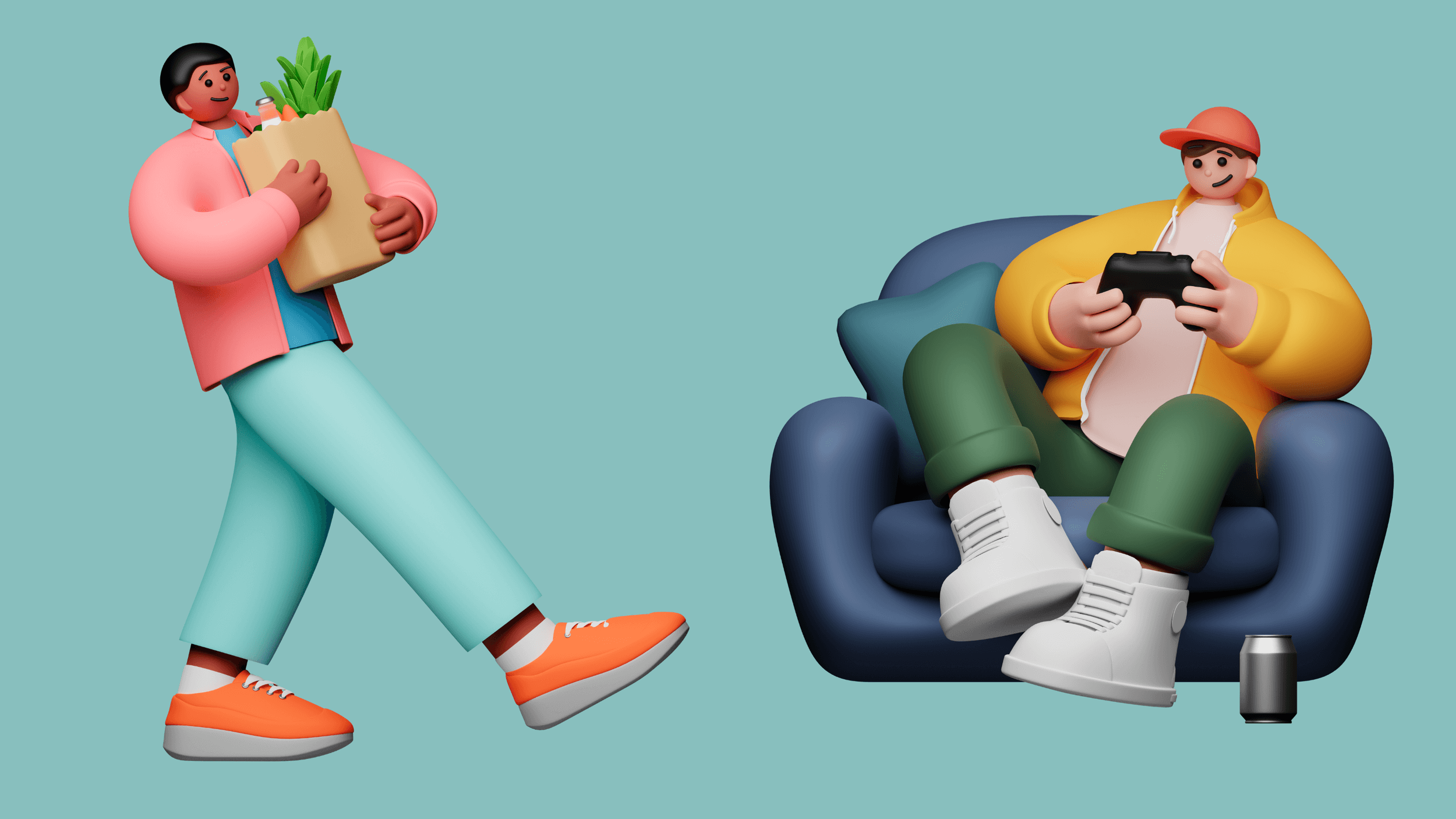
From the artists who brought you the most disgusting looking characters in UI design that have plagued the mind of the average internet surfer for the past 10 years and shortened my lifespan almost as much as it has shortened my hairline, I'm proud to present to you-
Claymorphism!
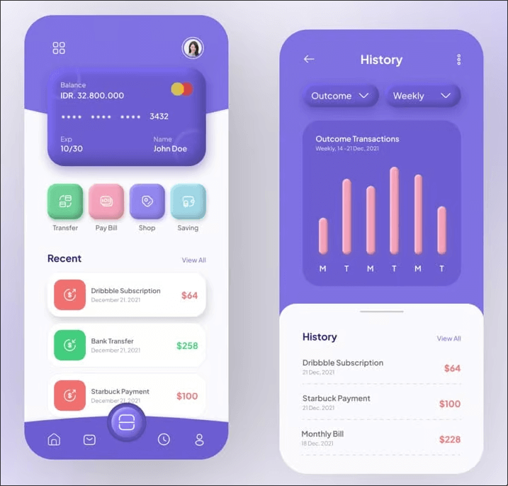
As you can see, claymorphism is a Fisker Gone Wild party. The buttons aren't rounded, they are ROUNDED. The shadows and highlights reach out like they are trying to snatch the font off the button. Everything is overly rounded, so much so that if I turned this in to my teacher at Full Sail, that fucker would've failed me without blinking. Unlike Neumorphism which is a latex fetish given credibility and a nice coat of paint, Claymorphism hovers off the screen like the floor is lava.
Claymorphism just goes to show that art truly is subjective, and no matter what your teacher said, stick figures are perfectly viable methods of characterization and deserve to stand alongside every other art technique like Chicken Scratch and accidentally dropping your canvas in the studio, which no one ever cleans before they fucking leave, so now it's covered in dust and unsalvageable. Nothing about stick men are gaslighting and I don't like buzzwords like that.
Get a fucking grip.
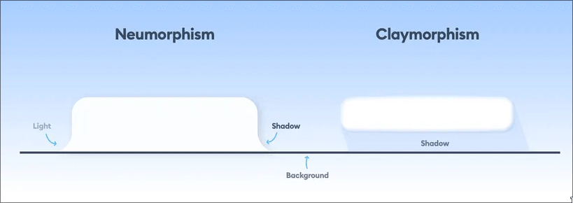
At first, you can fool yourself into thinking this is cool, but the more you look at it...I don't know, there's just something so...inconsistent about Claymorphism in action, y'know? Is it just me?
Look at that credit card example again. The difference in ROUNDED percentage is about the same between the elements, but it's struggling far more on the smaller components than the bigger ones. But having multiple sizes is an important part of the Graphic Design principal of Hierarchy, or so I'm told. When the buttons are so small that the shadows start to touch the highlights in such a way that I could put them behind bars for it.
It doesn't help that the page isn't exactly leaning super hard into the style. So I'll get another example for us, okay? Don't move. I'll be right back.

Once again, at first, this is sick isn't it? It's like 😆, but then you give it like 10 minutes of thought and all of the sudden, 😷.
I think that's the issue with playful UI. It is fun and enjoyable, but quickly you reach this point where you aren't charmed any longer and it becomes gross to look at. I'm not posting that Grubhub commercial but you know exactly what I'm talking about right?
There has to be a middleground between the tactile feel of Neumorphism and the playful pop of Claymorphism. If only a multi-national conglomerate with billions and billions of dollars had backed a particualr UI style in house that combined the strengths of these two abandoned styles.
Unfortunatly, it doesn't exist.
Okay, cya~ | Luther
Fluent Illustrations
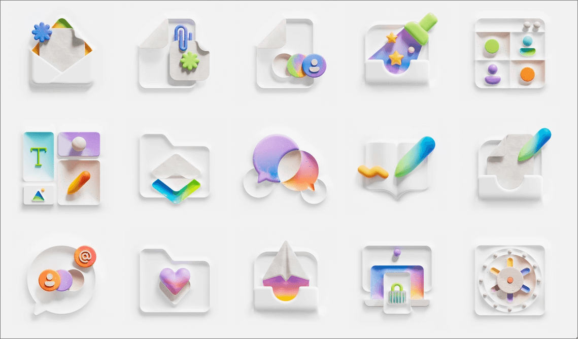
Can you say, Thank You Microsoft? Come on! All together let's thank the multi-national conglomerate has has commited some of the worst crimes against software, locked the world into their bloated and dangerously unoptomized Operating Systems, lobbied against solutions that create a free and open internet for anyone and everyone, and now get on their hands and knees to tell users that their AI is useful and shouldn't be forgotten after they poured billions of dollars into infastructure and service fees.
Thank you, Microsoft!!!
whistle
That was me whistling.
Isn't this nice? We have the tactile and intergrated feel of shrink-wrapped buttons. The rounded and extended shadows of clay. There are no outlines, just shade and contrast. The icons sit on some type of shelf, content to exist on their own. This is the methodology behind a LOT of Microsoft's Fluent Design. It's "together" the same way that your dad spending most of his time in the shed is "together".
It doesn't repeat, it echoes. I think my favorite part of this is the texture work. Not only is it rather sparse, but it's this strange glitter-doodle bug aesthetic that's mixed with that one asshole kid in your class who kept mixing up all the fucking clay and so now no one can use just normal red clay, they have to use the red x blue x purple x brown clay.
Could you do this with just CSS? Sure. Anything can be done with JUST CSS. But should you? Of course not! That'd be crazy! These icons are basically 3D renders. Extruded faces that had a couple point-lights shown on them from key angles. The best part of this is that it's not getting old for me. I could stare at this all day, and I don't think that's because I'm Wallace & Gromit starved over here.
I think the key thing it was missing was texture. And now I keep throwing the question around in my head, did we really land on the moon? And then the other question, what would a full GTK or QT interface look like when every single element looked like this?
I just got done being strung along like a dog on a leash by this fantastic youtuber named Liber-Indigo. Spoilers for his Affordance of Magic series, but in the end he smokes enough whatever-the-hell to come up with Gravitational UI. Something like a mindmap that can be navigated with tabs and references.
I'm also keeping my eye on a cool piece of software called Tag Studio. It has a booru tagging system for your files and though it's early days, it looks very interesting. They have 3D preview functionality on the way.
I also saw this guy named EJFox make a virtual memory palace to manage his files and documents in VR. He can pick up the files and website links like cards, throw them around, link them with wires, and it's all very physical.
Why did I bring all of these things up at the same time?
Dunno, anyways I got nothing to do.
Peace~ | Luther✌🏿
